Context
Context
I've used Opay for seven years. Recently, my card expired. I opened the app, ordered a replacement, and it arrived within days. No branch visit, no paperwork, no banking hall queue. Just a few taps.
A week later, I misplaced that card. Frustrated, I ordered another one. Same seamless experience. Within days, doorstep delivery, zero friction.
When it arrived, I just held it. Looked at it. And a question surfaced: if Opay can do this so effortlessly, why don't high-net-worth individuals trust it for anything beyond convenience transactions? The infrastructure clearly works.
So what's the problem?

The Gap
The Gap
Opay processes millions of daily transactions with infrastructure reliability that rivals established banks. My card replacement proved this. The same request through traditional banks means branch visits, banking hall waits, and unnecessary paperwork. Yet mention Opay for large business accounts or heavy investment planning, and people politely dismiss it. The platform became essential to daily financial life but peripheral to financial planning.
I started paying attention to how the brand showed up. Saturated greens everywhere. Photography of people with exaggerated gestures celebrating transactions. Dense screens trying to show every feature at once. Marketing that shouted instead of spoke.


This visual language made sense once. When building trust from zero, you show everything. You reassure constantly. You compete through visibility. But Opay isn't starting from zero anymore. It's operationally mature. The brand just hasn't caught up.
The question wasn't about features or performance. Those were competitive. The question was permission: what makes users believe a platform is for them at their next level of need?
The Evolution
The Evolution
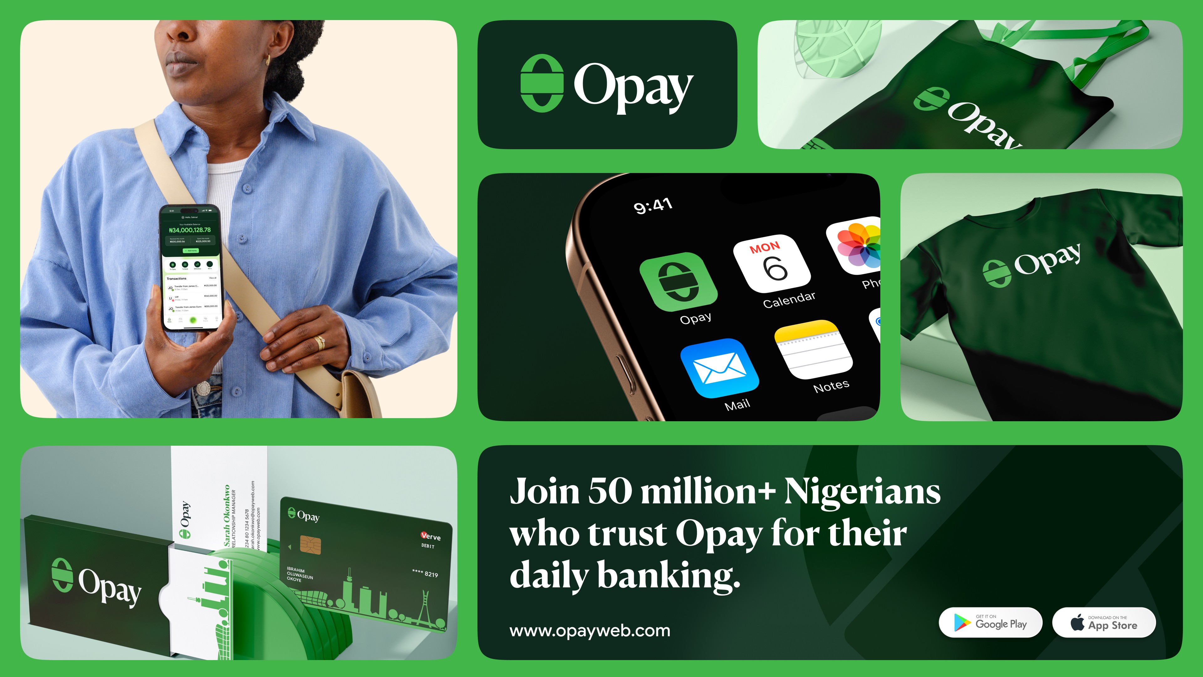
I kept the green but I shifted it from saturated to refined. Rich enough to signal premium, familiar enough to stay recognisable.
I kept the green but I shifted it from saturated to refined. Rich enough to signal premium, familiar enough to stay recognisable.

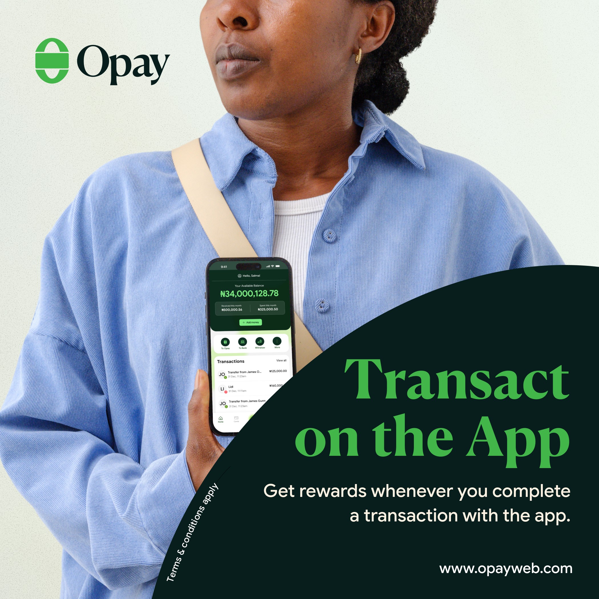
The typography gained weight and breathing room. Information density dropped significantly. Screens now assume you know what you're doing instead of explaining everything constantly. Photography moved from performative energy to understated capability.
The typography gained weight and breathing room. Information density dropped significantly. Screens now assume you know what you're doing instead of explaining everything constantly. Photography moved from performative energy to understated capability.


Most importantly, I built flexibility into the system. Multiple card treatments. Tonal range from pure green to neutral backgrounds. This lets the same brand serve multiple customer profiles.
The black card variant matters. Some users want brand-forward design. Others want understated premium. The system accommodates both without fragmenting recognition.

System Flexibility
System Flexibility
The proposed visual system evangelizes a toned green, keeps core interaction patterns intact, preserves the speed and directness that made adoption easy. What changes is tone, density, and hierarchy.
Think of it like a well-tailored shirt that works across occasions. The foundation is neutral enough to dress up or down, but distinctive enough to remain recognisable. The green signals balance to both high-net-worth and mass-market customers. The typography prioritizes clarity. The restraint in application creates space for the platform to be taken seriously in contexts where the previous visual language would have
been dismissed.

Learnings
Learnings
Product maturity and design maturity aren't the same timeline. Opay's product matured through operational scale. The design needed to mature through perceptual clarity. Fewer elements doing more work. Systems that suggest confidence instead of demanding attention.
The challenge wasn't redesigning everything. It was understanding what the current design language signaled versus what the platform actually delivers. Then removing the aesthetic barriers preventing people from seeing the capability that's already there.
My experience with Opay's card service is proof: infrastructure that works seamlessly, wrapped in a brand that still looks like it's trying to earn your trust rather than being confident it already has.
Sometimes the boldest design move is knowing when to speak more quietly.


More works


Building institutional trust through strategic brand evolution
Building institutional trust through strategic brand evolution
ROLE
Designer, Strategist
TAGS
Branding
Product
Dec. 2025
COMPANY
Opay
COLLABORATORS
Just Me (An independent exploration)

